

We’ve been working on testing and improving the accessibility of KPR’s websites. The first step in this process was conducting systematic do-it-yourself accessibility testing, which we described in an earlier post. This post presents the main problems revealed by the tests and gives some details about how we fixed them.

What websites are we talking about?
It’s worth at least briefly describing the websites we tested, since that affects the types of errors we might see and the degree of control we have over fixing them. This project focused on two websites developed and maintained by KPR: the KPR main site and our AT-node application.
The KPR main site is our regular website for the company, providing basic information about what we do. It also includes some e-commerce purchase pages for our Compass software. This is a pretty straightforward site that we code ourselves, using HTML, CSS, PHP, and javascript. There is also a WordPress blog connected to the site. We tested 25 pages from the KPR site, including all the non-blog pages, the blog index page, and a representative blog post.

The AT-node site is a web application, provided as a free tool to search the research evidence on text entry by computer users with disabilities. It’s written in the Flask Python framework, which delivers HTML pages to the browser via templates, and uses Bootstrap for styling the pages. The challenge with testing the accessibility of AT-node is that the page content is often dynamic. For example, the contents of AT-node’s report page depends on the search results returned by the database. When we don’t know for sure what will be on each page, it’s tough to test its accessibility with 100% confidence. Still, it’s possible to define common scenarios and test those, which is what we did. We tested all 14 pages in the AT-node application.

Overview of accessibility issues found
For each page, we ran automated tests with the W3C validator and WAVE evaluation tool, then did human testing for 25 WCAG Level A guidelines. (For more details on the testing methods, see our previous post.) We found 17 different types of accessibility issues across the two websites. These are listed in the table below, sorted by how we found them (with the W3C validator, WAVE, or human testing) and how difficult they were to fix. We gave a rating of Easy for an issue that was fixed by a quick web search and minor code tweak. More Difficult refers to a fix that required some additional digging to figure out the issue and/or a more significant code rewrite to implement the fix.
| Accessibility issue | How found | Ease of fix |
|---|---|---|
| HTML/CSS syntax errors |  |
 |
| No language set at top of page | |
|
| Redundant role attributes | |
|
| Duplicate id on page | |
 |
| Missing alt text |  |
|
| Low visual contrast | |
|
| Input fields with missing labels | |
|
| Empty table header | |
|
| No asterisks for required fields |  |
|
| No form validation for email format | |
|
| Video captions could be improved | |
|
| No Skip-to-content link | |
|
| Ambiguous links | |
|
| Nothing spoken for tribar menu button | |
|
| Invisible focus for tribar button | |
|
| Links skipped with keyboard navigation | |
|
| Button text change not announced | |
|
| Symbol key: | W3C validator |
Easy |
| WAVE |
More difficult |
|
| Human |
Fixing the issues to enhance accessibility
I’m assuming that no one wants to read a listing from 1 to 17 on exactly how we fixed each item, especially when a lot of this is covered very well on sites like WebAIM. But I do want to present a few examples to give you a feel for what these fixes involved. If you have questions about any of the other fixes, just let me know.
Low visual contrast
WAVE is a terrific tool for finding (most of) the visual contrast issues on a page. It also provides a handy contrast checker to help you fix them efficiently. The KPR main site had contrast errors on only one page (the purchase page provided by our e-commerce supplier), but the AT-node site had multiple contrast errors on just about every page.
Typically, contrast errors are easy to fix by adjusting the colors used for foreground and background colors within your CSS styling rules. In some cases, the CSS styling may be written by a third-party provider, such as Bootstrap, and it may require a bit of investigation to figure out which style is the culprit and how to override it.
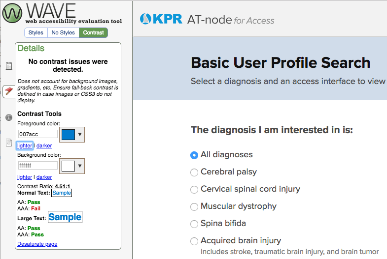
One thing to be aware of is that WAVE, as wonderful as it is, cannot find every single contrast issue that exists on a page. For example, WAVE did not notice that the button on our subscription form only had a contrast ratio of 2.32, well below the 4.5 standard. It turns out that WAVE (version 1.0.9) can’t automatically detect contrast issues for at least the following items:
- button text, within
<button>elements - hover states of elements or other dynamic states
- text within images
For those items, you’ll need to check the contrast ratios yourself. You can use WAVE’s built-in checker to do that, as in the screenshot above. There are also a slew of other contrast checkers to try, such as Acart’s Contrast Checker or the ones listed by axess lab.
Improving video captions
The KPR main site includes a few video tutorials that explain how to use our software. These are pretty typical screencasts that combine video of the computer screen with spoken narration. While there’s some text content on the screen, someone who has trouble hearing, or just doesn’t want to play the audio out loud, would have trouble getting all the information provided in the tutorial. So, text captions are important.
Because we host the videos on KPR’s Youtube channel, we can take advantage of the automatic captioning that Youtube provides. For videos like ours, with a sort of newscaster narration approach, the automatic captioning works surprisingly well. However, it can’t get every word right, and the captions have no punctuation or other conventions that help readability.
An easy win is to just edit the automatic captions. The procedure is simple and quick, and at the end you’ve got a nicely captioned video that looks more professional and is easier to read than the default auto-captioning. (This is also a good student project if you have some part-time helpers available.)

Links skipped with keyboard navigation
If desired, a user ought to be able to use only the keyboard to move through the user interface elements of a page (like buttons, links, or form fields). Browsers are set up to support this by default, so this should “just work,” as they say. But our human testing revealed some AT-node pages where tabbing skipped some links altogether. Why? I thought links (<a> elements) were focusable automatically. This confusion led to the More Difficult rating for this fix.
It turns out that we had an <a> element that was coded to behave like a button, using an <a onclick> pattern. As explained in this post by Deque Systems, an <a href> element is focusable by default, but <a onclick> is *not*. What we should have done from the start is code the element as an official <button>, since that is a better semantic match to the function of the element. When we changed the <a onclick> to <button>, we fixed the keyboard navigation problem and improved the clarity of our code in the bargain.
Ambiguous links
Here’s one that turned out to be trickier than expected. Sometimes you want your page to include text that is only spoken by a screen reader. For example, you have a series of ‘Learn more’ links, and you want the screen reader to say “Learn more about Compass software” for one link and “Learn more about our research” for another. The added spoken text helps make the destination more clear to someone who can’t use the surrounding text for context. Without that added text, the link is ambiguous, because the screen reader user just hears “Learn more” for each link.
The typical way to code this is to create invisible text that only the screen reader will say:
<a href="your-url">

  Read more

 <span class="screen-reader-text"> about kittens</span>

</a>
You then use CSS to style the screen-reader-text to be invisible on the screen, but readable by a screen reader. KPR’s blog has this approach built-in by the accessible WordPress theme that we use, and we use this approach in a few other areas of the site.
So far, so good: we have a well-known issue, with a well-established solution. What could go wrong? The problem came when I tried it out using the VoiceOver screen reader. On both Chrome and Safari, VoiceOver reversed the word order: instead of saying “Read more about kittens”, as intended, it said “About kittens read more.” The reversed message does mostly get the point across, but sounds a bit like Yoda from Star Wars, or maybe a bad translation of German.
When investigating this, I had trouble finding information online about the reverse order problem. I tried adjusting the styling rules that govern the screen-reader-text class, and got some useful insights from the good folks at WebAIM. Apparently the standard approach does work properly on Windows-based screen readers, so the issue is limited to VoiceOver. I decided to keep things as-is; the risk of breaking something else by tweaking the styling wasn’t worth the incremental gain in accessibility. Hopefully the root cause, whatever it is, will get fixed eventually.
Empty table header
This one came as a surprise, and it was difficult to find any information about this on the web. We ran WAVE on an AT-node report page, and got this error: “Empty table header. A table header (<th>) contains no text.” Clicking on WAVE’s handy <code> button showed that the errors related to code generated by Google Charts. Huh? Why is there a table within a chart?
To backup a step, the AT-node report page draws several different graphs that display retrieved data, and it uses the Google Charts package to do this. These are histograms and bar graphs, so the challenge is how to present the graph information in a form that is accessible to someone with visual impairments.
It turns out that Google Charts takes it upon itself to produce a table that lists all the data in the chart. The table isn’t displayed visually, but it’s available for reading by screen readers, using a technique similar to the screen-reader-text class described above. That’s a good thing, as it represents an attempt to improve access to the data. But that table is where the trouble was: with an empty table header, it would be hard to understand the data.

After some debugging, I realized that the chart data started out with information in its table header, but then lost it along the way as I processed the data to get it into the right shape for the chart. (More specifically, running the column data of a DataView through a function appears to lose the column header information.) Luckily, I was able to put the table header information back into the data downstream, and thus fix the error.
Could we fix everything?
We fixed a lot of stuff. I’m sure we missed some errors, but overall we enhanced the accessibility of our sites substantially. But, no, we couldn’t fix everything. We went from a combined 386 errors on the two sites to 98 errors remaining. 90 of those errors are on the two e-commerce pages within the KPR main site. These are pages that we have limited control over, since they are generated by our e-commerce provider. It sounds like a cop-out, but it’s often difficult to manage the accessibility of third-party code. This is something we’ll grapple with in our next post.
Bottom line
Here are a few take-home points from our experience:
- A mix of automated and human testing is important.
- There are quite a few easy wins.
- But some that seem easy at first may have glitches.
- Third-party code can introduce unexpected issues (more on that in a future post).
What’s been your experience with fixing accessibility issues? If you’d like any more details about what we did, please let us know!