

As promised in our previous post, today we’re going to delve more deeply into our dataset of text entry rate across 177 individuals with physical disabilities. (If you haven’t seen the infographic and read about the creation of this dataset already, you might want to read that earlier post first.)
So without further ado, here’s the histogram itself:
Histogram 101
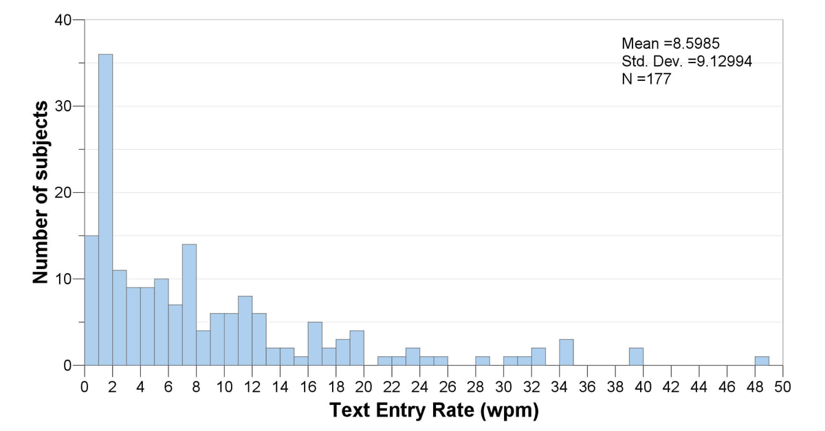
We start with a dataset containing 177 data points. Each data point represents the words per minute text entry rate for a unique individual with a physical disability. In other words, 177 different individuals are represented in the dataset.
A histogram looks like a bar graph, but it’s not. It shows how many data points fall into each interval of values. In this case, we’ve divided the data up into intervals of 1 word per minute. So the left-most bar in the histogram shows how many data points fell between 0 and 1 word per minute (15 data points); the next bar shows how many were between 1 and 2 words per minute (36); and so on. The right-most bar shows that we have 1 datapoint between 48 and 49 words per minute; this datapoint is the maximum in the dataset. (The Wikipedia page on histograms has some illustrations and info that might be helpful if you want more detail on this.)
A common use of a histogram is to see whether a dataset tends to follow a normal distribution, one that follows a symmetrical bell curve. In this case, the data are definitely not normal. Instead, it is skewed heavily to the right, with a long tail of data spreading out in the zone from about 8 to 50 words per minute.
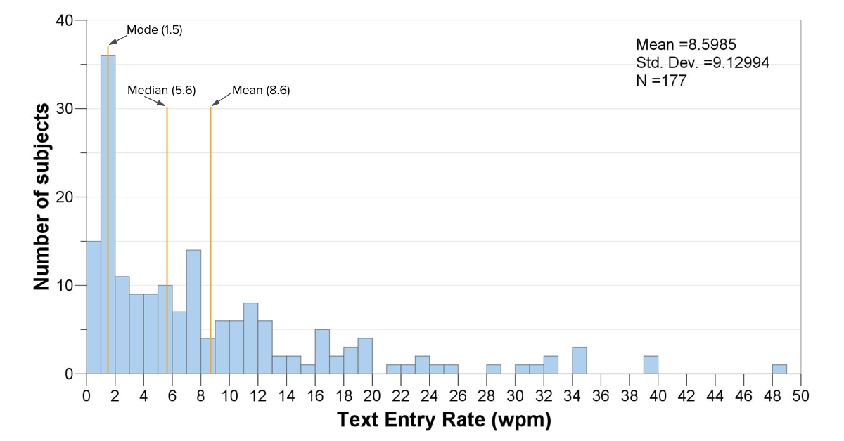
A histogram also gives us a sense of the central tendency of a dataset. As a quick refresher, commonly used measures for central tendency include the mean (average), the median (where half the data are below the median, and half above it), and the mode (the most frequent score in the dataset, i.e., the tallest bar in the histogram). For a perfectly normal dataset, the average (mean) will exactly equal the median, because the distribution will be exactly symmetrical. If this perfectly normal dataset also has a single peak in its distribution (called a unimodal distribution), then the mode will also be the same as the average. In other words, the closer the mean, median, and mode are to each other, the more normally distributed the dataset is.
In this case, the mean is 8.6 words per minute, while the median is 5.6 wpm, and the mode is all the way down to 1.5 wpm. The large difference between these metrics reflects the non-normality of the distribution. The mean is relatively high because the faster typists, while fairly few and far between, pull up the average significantly.
What does this histogram mean?
From a data analysis standpoint, the wide range and non-normality of the distribution tell us that we aren’t really dealing with a homogeneous dataset. So if we’re going to do further statistical analysis, we will need to take that into account. One thing we could do is to take sub-samples of this dataset that might be more normally distributed, such as all those who use, say, single-switch scanning. Or, we could use statistical procedures that don’t require a normally distributed dataset. It depends on the question we’re asking of the data, but in any case the histogram lets us know that we need to pay attention to the non-normality in the distribution.
From a data interpretation standpoint, this histogram provides several insights:
- First, the most common text entry rate was only 1.5 wpm. This may be partially due to selection bias in the research studies, but it does suggest that access systems may not be providing sufficiently high performance for some people with disabilities.
- About 10% of the dataset is typing at rates that exceed 20 wpm. That’s a fairly good clip. We could examine those datapoints for ideas about what might be enabling that relatively fast performance.
- The diversity in the dataset (and our knowledge about the range of individuals included in the dataset) suggests that there could be many factors that influence text entry rate for this population. This is not a new idea, but it is useful to see confirmation in the data. With further analysis based on type of interface, diagnosis, body site, user experience, etc., we might learn more about what those factors are and which ones are most significant. Indeed, this has been the focus of two papers we published recently, one focused on interface type, and the other focused on factors related to user characteristics.
The histogram is really mostly a starting point for visualizing and working with a dataset, but it is an essential starting point for data analysis and can provide useful interpretive insights as well.
Next steps
See more information and links to publications at kpronline.com/ter-review.
Search the data yourself at kpronline.com/atnode.
What questions do you have about these data? How might this information inform what you do?